***Written by Arlyn Hernandez
We’re on the trend train this January, and while we’ve already touched on what we think is going to be “in” for kitchens, bathrooms, and furniture and decor, we’ve been itching, nay violently scratching, to talk about colors, specifically paint. Last year, I wrote about my desperate cry for more colored walls in design, after years and years of white being the gold standard and I’m happy to report today that I’ve absolutely noticed a slide into other colors. I don’t think people have run out all of a sudden to their local paint counter and bought up all the brights and bolds they could get their hands on because of my article. Not by ANY means, but I sniff a shift, and it smells really good.
So, I’m quite happy to report that this post is not full of a bunch of different shades of white and gray (though we are always talking about the perfect white and should probably go ahead and do a round up of some of our go-to shades), but actual color. Truly and honestly, and I know we’ve said this so many times before, paint is the cheapest and most reversible way to make a HUGE impact in a room. That, and some subtle architectural details like molding. If your walls could talk, I promise they’d beg you for a nice warm coat of some sexy, sexy paint.
Which brings us here. The editorial and design teams put their heads together to drill down and dig up the colors we’re seeing and loving, and are going to move forward on calling out as a “trend.” This is not to say that should you choose something not called out in this list, you’re somehow wrong, but if you’re on the hunt for something fresh and new for your home, we hope this will be a good guide for you.
Mossy Green
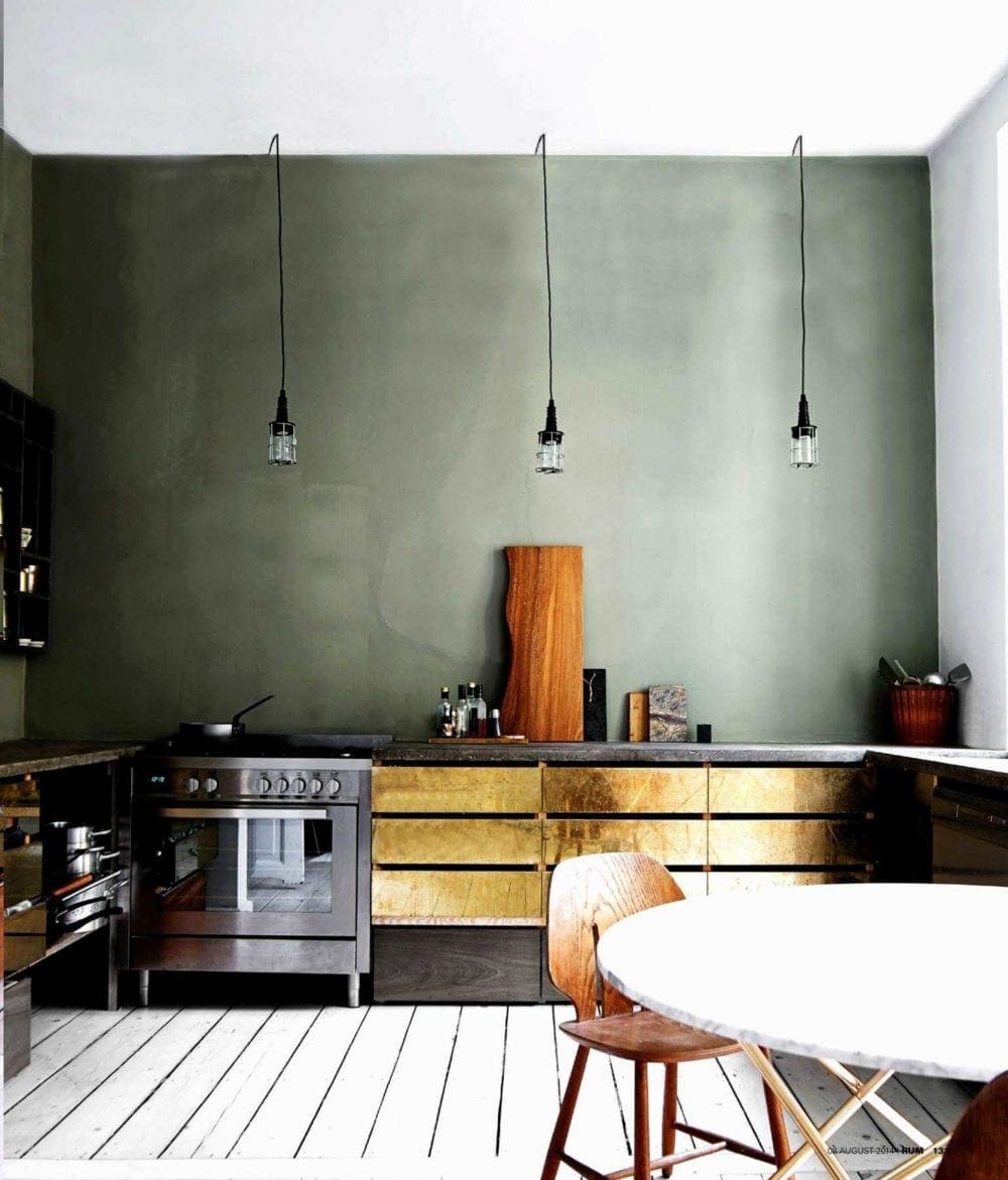 image source | design by Ste. Marie
Moody greens were not up for debate. It was the first color out of at least three of our mouths when we were sitting around, braiding each others’ hair and talking about paint trends (though Michael petitioned HARD for a clearer, brighter emerald green, it didn’t win out today, sorry). If you’re doing a little dance in your chair right now, be sure to head to this post where we really dove into the whole green-is-the-new-white idea. Deep almost blue-ish greens have been super popular lately, but we’re really excited about this more mossy, dusty green with slight olive undertones.
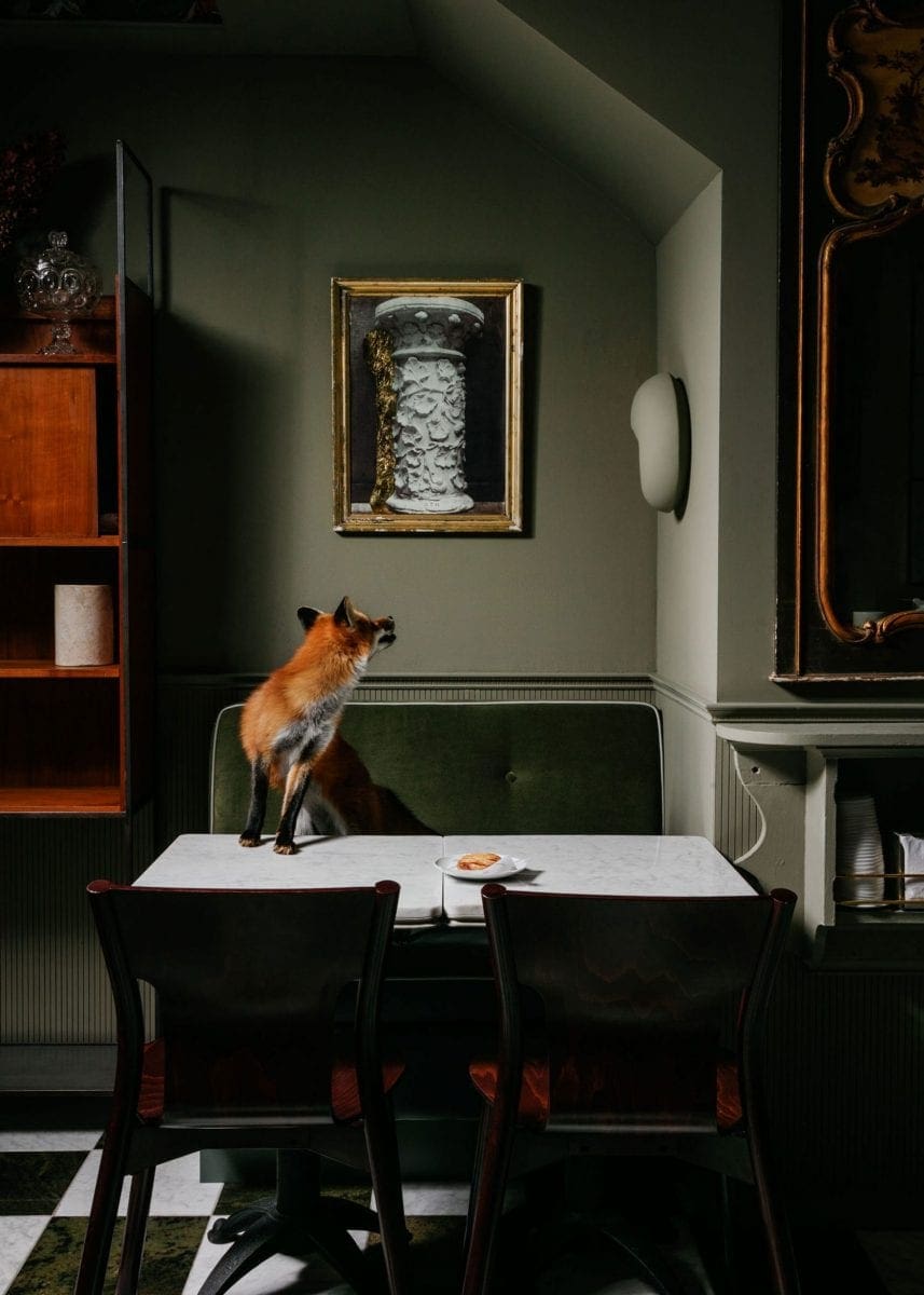 image source | design by Ste. Marie
We personally don’t think a tone like this would work very well in anything other than a super matte finish (unless you pair that on a wall with the same colored molding in a higher sheen). You can always bring in a touch of glam with shinier velvets, marble or polished woods (or a fox) if the chalkiness falls flat to you.
 image source | design by Billy Cotton
It also comes off so, so lovely and Old World when the palette built around it is also rich and moody. It’s definitely a heavy look (some might call it “granny,” except I hate the use of that word…as if grandmas can’t be really cool and full of style…).
Schoolhouse Green
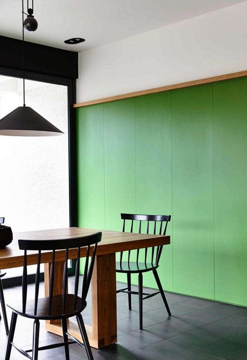 image source | design by Kennedy Nolan
For anyone that was bored by that last green, thinking it was dull and dour:: cough MICHAEL cough::, we present you with a much happier, zippy green. It’s what we’re calling “schoolhouse green” because it’s kind of that tone that can be found in chalkboards and seats in grade schools the world over (though I highly suspect schools don’t even have chalkboards anymore and have been replaced with something much higher tech like dry erase boards or holograms). The color in the above photo is ALIVE people, and while probably too bold of a move for most, it can be a seriously fun jolt in a room with mostly neutrals.
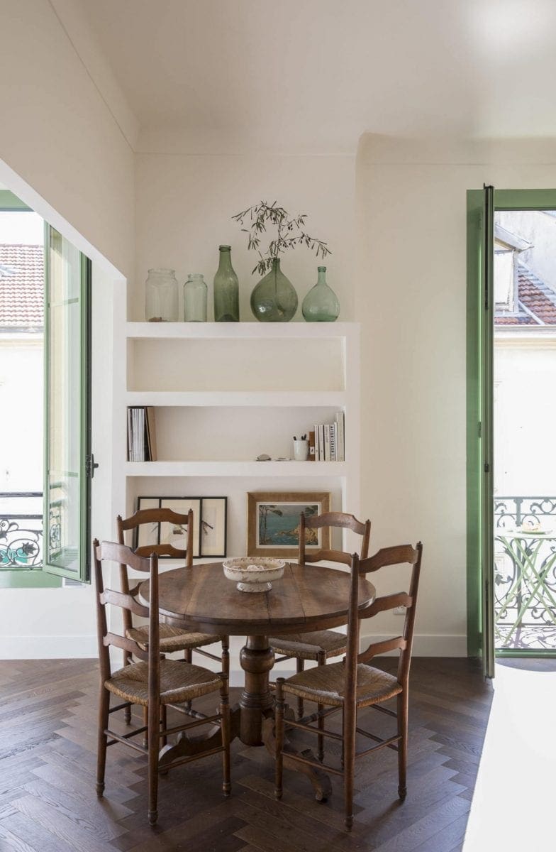 image source | design by Helen Cathcart
Here’s a hot tip on bringing in a color that might feel like it would just be too suffocating on a whole wall: paint window and door trims in it, and leave your walls a lighter shade or even white. It’s a really European touch that we give the thumbs up to.
Teal
 image source | design by Giancarlo Valle
I can already hear all the “this reminds me of the ’80s and I’m not going back” outcries, but just because it was done in the decade that gets the worst rap for design and fashion doesn’t mean it can’t work in 2019. It’s all about how it’s used and what it’s paired with. In the room above, combined with mostly wood tones and soft neutrals in interesting silhouettes, it feels sharp, modern and sumptuous.
This color works particularly well on a wall + molding + built-ins situation in satin or high gloss. It’s already such a rich, showy color that you might as well get even flashier. Teal welcomes the attention (it’s like the Kardashian of the paint deck. It begs you to look at it, watch it, want to be it, buy its lip kits).
 photo by Sara Tramp for EHD | A Before & After House Tour
Ashley from The Gold Hive house tour we ran earlier this month painted her den this deep greenish blue that had us all oohing and ahhing over (it’s Benjamin Moore’s Salamander, which is actually much more of a hunter green in real life, but it photographs nearly teal and still wanted to show it to you for inspiration). It’s particularly chic with the equally striking blue velvet sofa set against it.
Dusty Blue
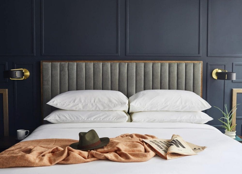 image source | design by Feltus Hawkins Design & Dryden Architecture and Design
A slate-y blue like this bedroom feels perhaps the most “EHD” shade here, but hey…we aren’t a one-trick pony, okay? And basically, any deep shade like this is definitely made even more eye-catching with molding painted the same color.
 image source | design by Kate Thornell-Staig
The more we looked at these cabinets, the more we saw the strong purple undertones, but actually, that’s kind of what’s nice about it. It’s a kind of hue you can’t quite place your finger on…is it blue? Is it purple? IS IT GRAY? We all wish we were as mysterious as this cabinet color.
Coral
We’re currently working on a post about all the things we’re seeing that we’re told are “big,” but we’re just not there yet with. Coral is kind of that. We were passing around paint decks to vote on paint colors we liked best for this post and it kept having to be introduced as “I mean, not for your actual house, but like, if it were, which would you pick?” It’s a hard sell to the EHD squad, but just because we aren’t 100% there yet with it doesn’t mean it’s not happening in the zeitgeist. It can be very pretty and invigorating in the right space, paired with the right colors (so far, we can swallow it when it teams up with warm neutrals or is colored blocked with rich oxblood reds and or rusty oranges…it’s fluid, it can go both ways).
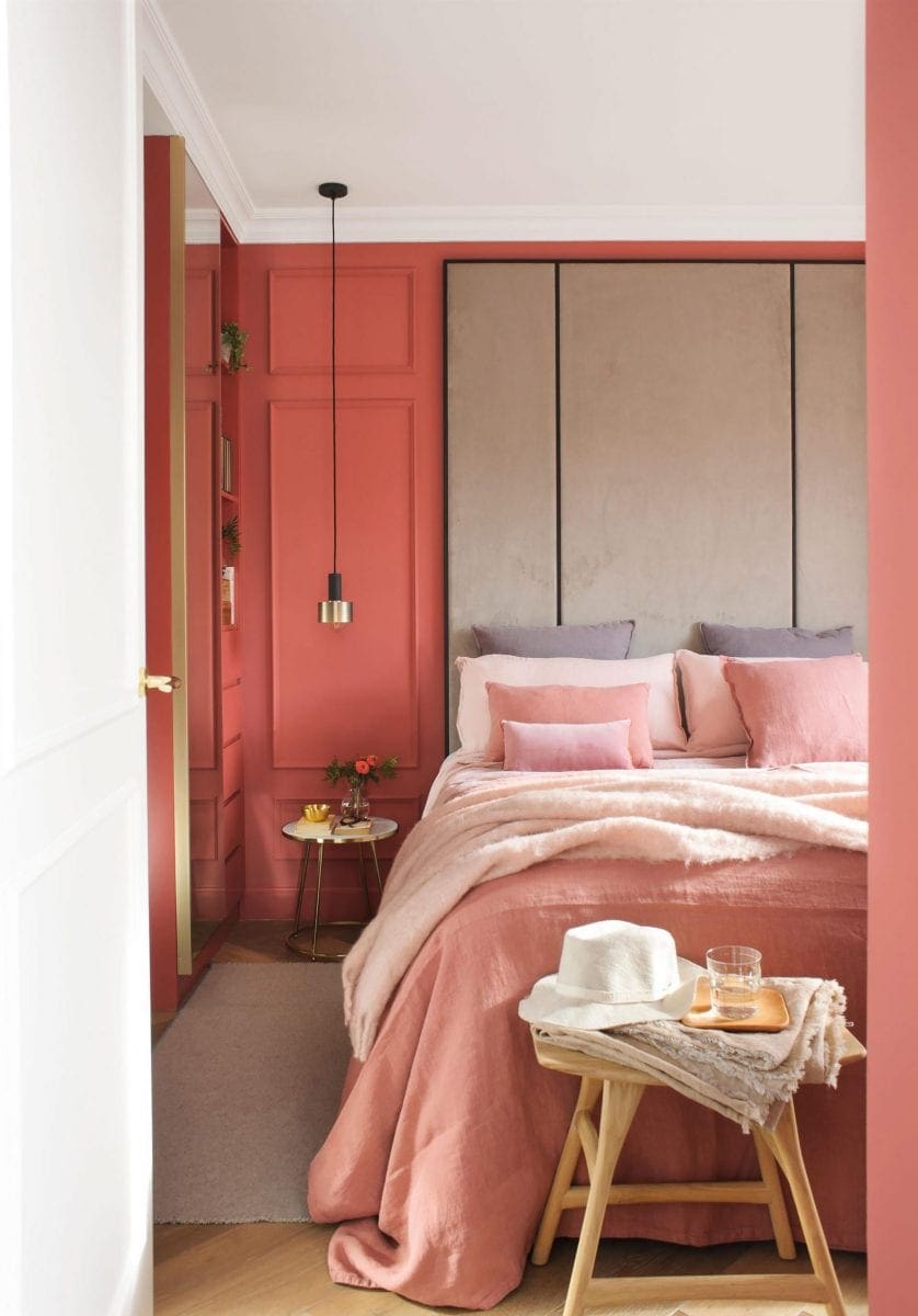
It does also work very nicely with other soft pastels, like lilac, periwinkle and blushy pinks. Hot tip: when you have a color like this that’s an attention hog, be sure to pair it with plenty of natural textures like wood, linen, nubby wools. It’ll ground it and make the room feel much more welcoming, and less like a showpiece.
Yellow
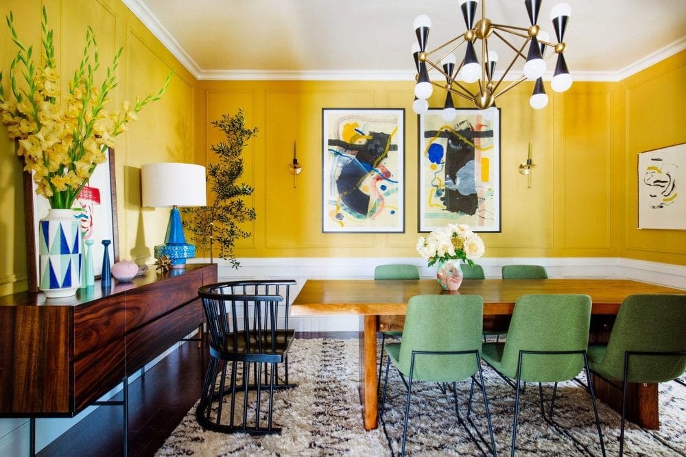 image source | design by Dabito of Old Brand New
This dining room GIVES ME LIFE. The pairing of colors feels so good and solid and not too matchy-matchy and that’s all I could ever want in a room. Bravo Dabito. And the star here is, of course, the Babouche yellow from Farrow & Ball that somehow doesn’t come off insane and like you’re inside the sun. The low white wainscotting treatment mellows it out, as does the wood dining table and credenza.
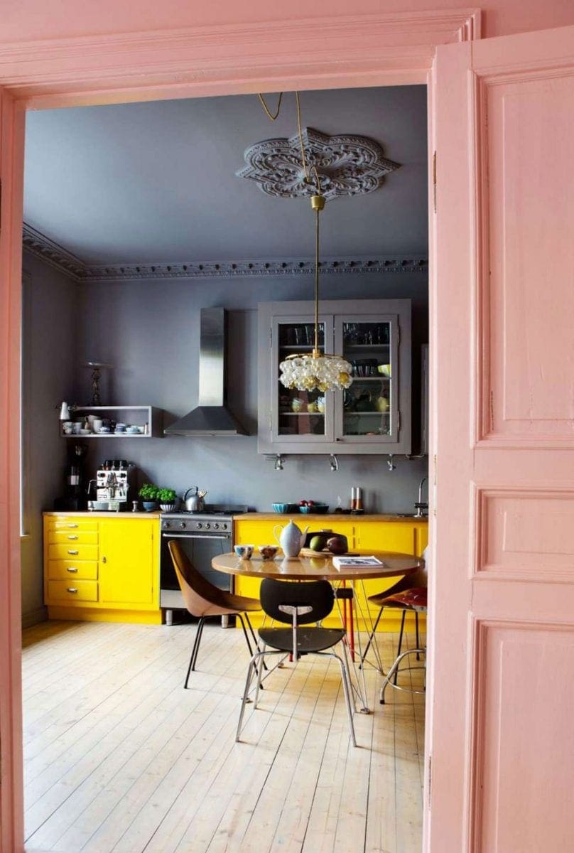
Dabito’s dining room was a touch mustard (super popular right now across furniture, textiles and decor, too), but this kitchen right here is like the happiest sun-shiny yellow we’ve seen and it brings a smile to our face. I know it’s not for everyone, but it’s for someone, okay, and if you’re that person, I want to be friends with you (and have breakfast at that table).
Dusty Rose
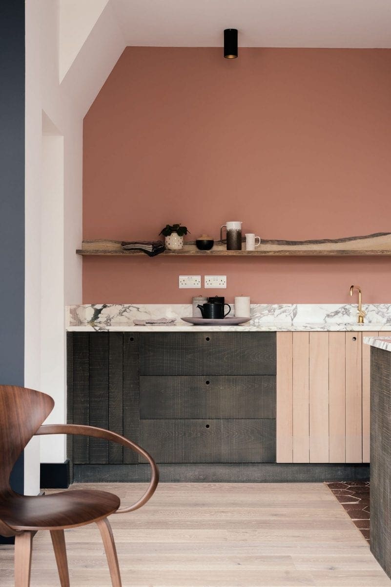 image source | design by deVOL
This color goes out to those of you who just can’t quite blush, but are maybe looking for a more grown version of it. Again, this absolutely brings back memories of the late ’80s and early ’90s design, but like anything else, it’s how you work with it. It can be really beautiful in an unexpected spot like the kitchen, elevated with rosy golds and marbles but balanced with rough-sewn and live-edge wood.
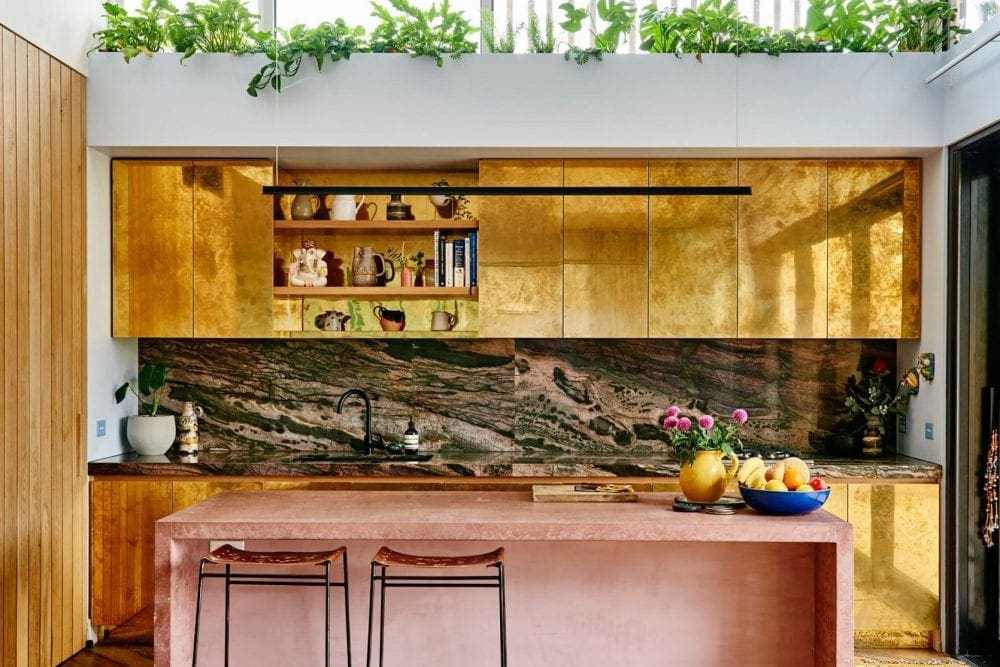 image source | design by Kip & Co
Oh, man, does this whole kitchen make my eyes pop out of my head (in a good way). Is it CAH-RAZY? YES, and that is precisely why I love to look at it. Living in it might be a bit of a different story, but a milky pink concrete kitchen island and BRASS CABINET FRONTS is the kind of boldness I wish I lived my life with more, right?
Before we go, we put together some EHD-approved paint decks for each of the colors we talked about. Oh, and we’re sharing these with the caveat that while some of the picks we know and love IRL, others we haven’t tested, so pretty please buy samples before painting a whole wall and then cursing us when you end up hating it. Hopefully, it’s all love and rainbows and happiness, but ALWAYS TEST YOUR PAINT before committing (you want to see how it looks in your specific room, with your specific amount of light). Okay, agreed?
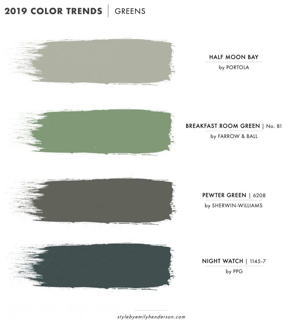
Half Moon Bay by Portola Paints & Glazes | Breakfast Room Green by Farrow & Ball | Pewter Green by Sherwin-Williams | Night Watch by PPG
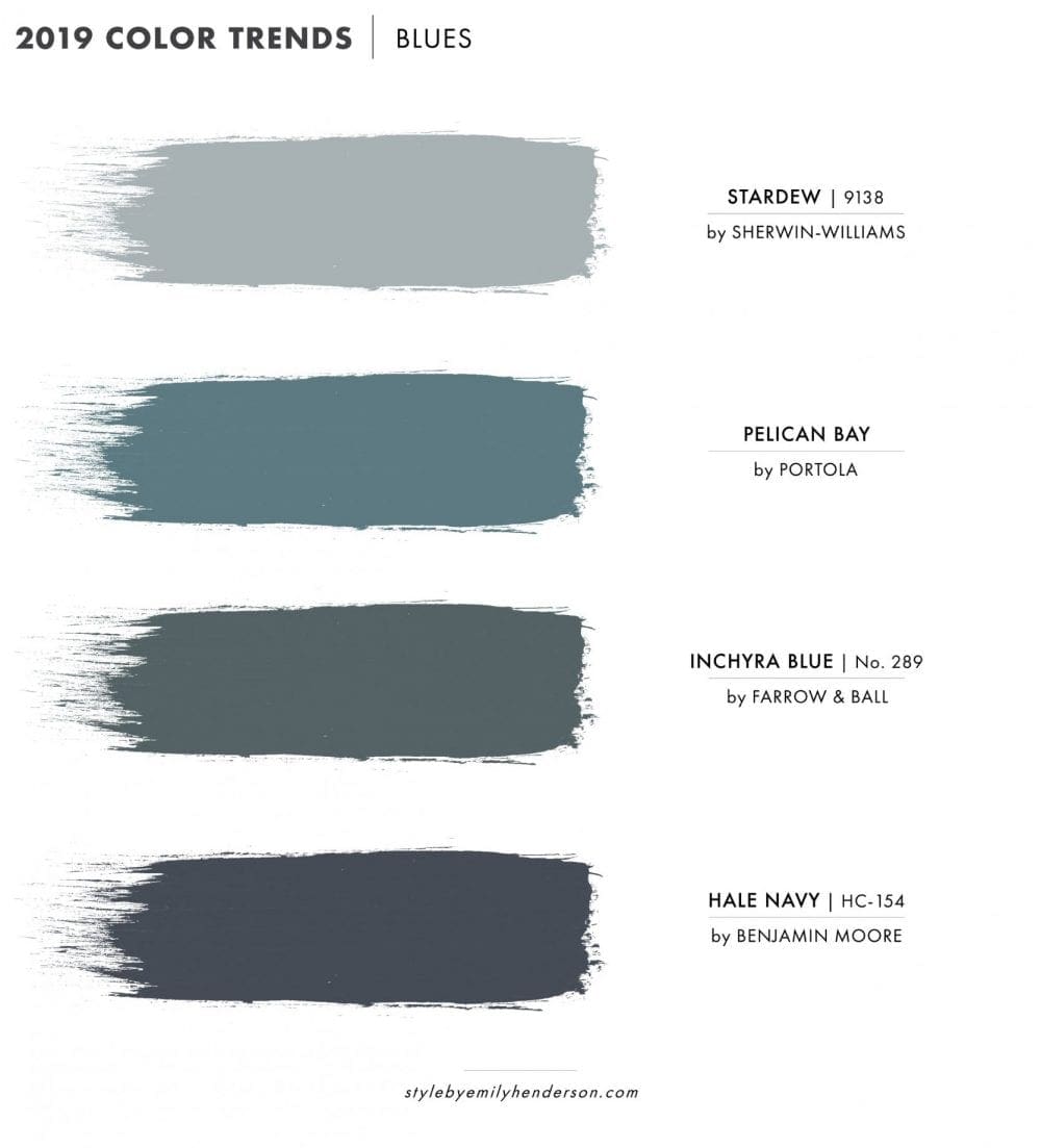
Stardew by Sherwin-Williams | Pelican Bay by Portola Paints & Glazes | Inchyra Blue by Farrow & Ball | Hale Navy by Benjamin Moore
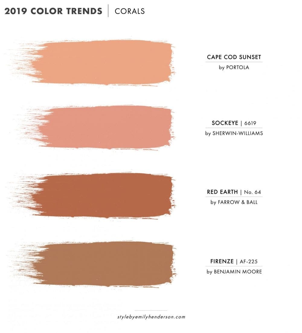
Cape Cod Summer by Portola Paints & Glazes | Sockeye by Sherwin-Williams | Red Earth by Farrow & Ball | Firenze by Benjamin Moore
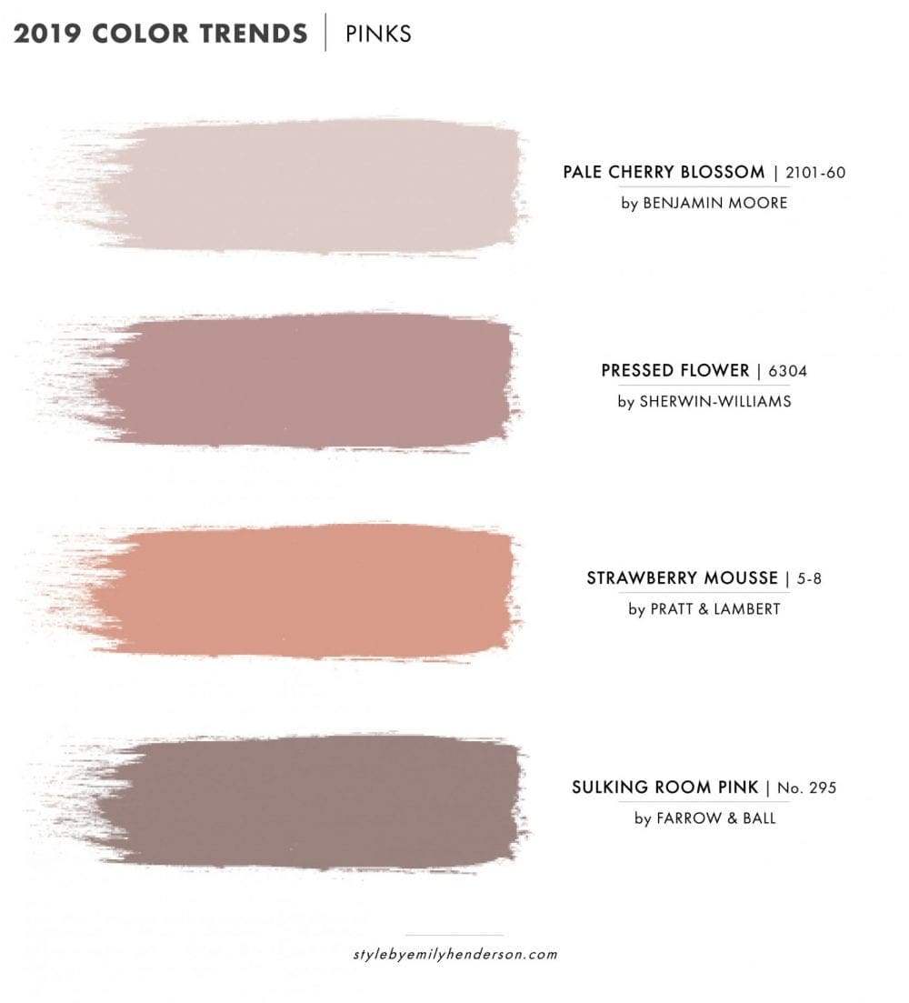
Pale Cherry Blossom by Benjamin Moore | Pressed Flower by Sherwin-Williams | Strawberry Mousse by Pratt & Lambert | Sulking Room-Pink by Farrow & Ball
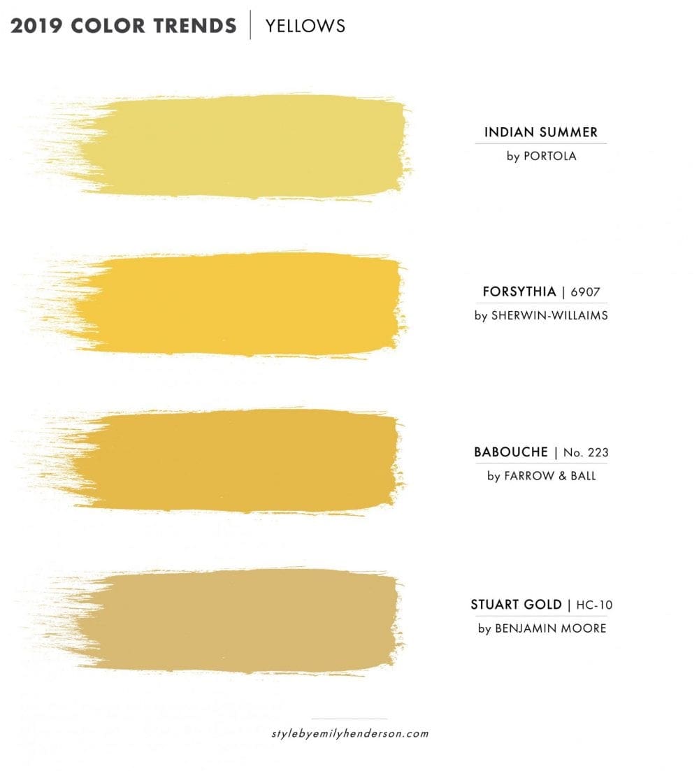
Indian Summer by Portola Paints & Glazes | Forsythia by Sherwin-Williams | Babouche by Farrow & Ball | Stuart Gold by Benjamin Moore
Alright, now it’s time to hear from all of you. What do you love? What do you veto? Beyond these 7 general hues, what else are you seeing that has you feeling like you can’t breathe when you see it because of its sheer beauty. Share links below or even just paint colors you know and love. We can’t wait to hear!
Comments